废话不多说,直接上代码:
1、HTML
<header class="module-layer">
<div class="module-layer-content">
<div class="search-box-cover"></div>
<p class="layer-return"></p>
<h1 class="layer-head-name">
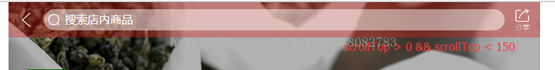
<div class="pr search-box">
<img class="shop-search" src="/UploadFiles/2021-04-02/search.png">
其中search-box-cover就是控制透明度渐变的背景
2、css
.module-layer {
width:100%;
position:fixed;
top:0;
left:0;
z-index:100000;
}
.module-layer-content {
position:relative;
min-width:320px;
max-width:750px;
width:100%;
margin:0 auto;
}
.module-layer-bg {
width:100%;
height:100%;
background:#000;
opacity:.7;
position:absolute;
top:0;
left:0;
z-index:-1;
}
.layer-head-name {
height:50px;
line-height:50px;
text-align:center;
padding:0 50px;
font-size:20px;
}
.layer-return,.layer-share {
width:50px;
height:50px;
line-height:50px;
text-align:center;
position:absolute;
top:0;
z-index:1;
}
.layer-return {
left:0;
}
.layer-share {
right:0;
}
.pr {
position:relative;
}
#shop-input::-webkit-input-placeholder {
color:#fff;
}
#shop-input:-moz-placeholder {
color:#fff;
}
#shop-input::-moz-placeholder {
color:#fff;
}
#shop-input:-ms-input-placeholder {
color:#fff;
}
#shop-input {
border:none;
outline:none;
background:transparent;
}
.search-box {
height:30px;
border-radius:20px;
top:10px;
overflow:hidden;
z-index:10;
}
.search-box:after {
content:'';
display:block;
width:100%;
height:30px;
background:#fff;
opacity:.5;
position:absolute;
top:0;
left:0px;
z-index:-1;
}
#shop-input {
height:28px;
line-height:28px;
font-size:16px;
position:absolute;
top:0;
left:30px;
}
3、js
$(function(){
var $body = $('body');
var setCoverOpacity = function() {
$body.find('.search-box-cover').css({
opacity: ((($body.scrollTop() / 150) > 0.9) "font-size: medium; font-family: Simsun; white-space: normal; word-spacing: 0px; text-transform: none; font-weight: normal; color: rgb(0,0,0); font-style: normal; text-align: center; orphans: 2; widows: 2; letter-spacing: normal; text-indent: 0px; font-variant-ligatures: normal; font-variant-caps: normal; -webkit-text-stroke-width: 0px">

注意:
特别注意的一条:强制刷新,会导致页面的重新加载,所以动态加入的css样式不会存在,那么对透明背景的初始化非常重要,在网页端用户强制刷新,才不会失去透明效果。
1、
((($body.scrollTop() / 150) > 0.9) ? 0.9 : ($body.scrollTop() / 150))
此三目表达式是判断当前滚动条位置所在位置,如果位置值除以150大于0.9,就返回0.9,反之就返回那个小于等于0.9的值,将返回的值设置为背景的透明度就完成了。
2、由于滚动条的位置是动态获取的,所以设置透明度会不停改变,不用单独再做渐变的动画效果。
3、最终透明度问题,京东在最终背景设置的是0.9,所以本案例也采用的0.9,同时体验效果会更好。
4、滚动条位置导致的渐变,将150设置更大,渐变的距离会更长。
以上所述是小编给大家介绍的基于JS实现仿京东搜索栏随滑动透明度渐变效果,希望对大家有所帮助,如果大家有任何疑问请给我留言,小编会及时回复大家的。在此也非常感谢大家对网站的支持!

华山资源网 Design By www.eoogi.com
广告合作:本站广告合作请联系QQ:858582 申请时备注:广告合作(否则不回)
免责声明:本站资源来自互联网收集,仅供用于学习和交流,请遵循相关法律法规,本站一切资源不代表本站立场,如有侵权、后门、不妥请联系本站删除!
免责声明:本站资源来自互联网收集,仅供用于学习和交流,请遵循相关法律法规,本站一切资源不代表本站立场,如有侵权、后门、不妥请联系本站删除!
华山资源网 Design By www.eoogi.com
暂无评论...
更新日志
2024年11月18日
2024年11月18日
- 【雨果唱片】中国管弦乐《鹿回头》WAV
- APM亚流新世代《一起冒险》[FLAC/分轨][106.77MB]
- 崔健《飞狗》律冻文化[WAV+CUE][1.1G]
- 罗志祥《舞状元 (Explicit)》[320K/MP3][66.77MB]
- 尤雅.1997-幽雅精粹2CD【南方】【WAV+CUE】
- 张惠妹.2007-STAR(引进版)【EMI百代】【WAV+CUE】
- 群星.2008-LOVE情歌集VOL.8【正东】【WAV+CUE】
- 罗志祥《舞状元 (Explicit)》[FLAC/分轨][360.76MB]
- Tank《我不伟大,至少我能改变我。》[320K/MP3][160.41MB]
- Tank《我不伟大,至少我能改变我。》[FLAC/分轨][236.89MB]
- CD圣经推荐-夏韶声《谙2》SACD-ISO
- 钟镇涛-《百分百钟镇涛》首批限量版SACD-ISO
- 群星《继续微笑致敬许冠杰》[低速原抓WAV+CUE]
- 潘秀琼.2003-国语难忘金曲珍藏集【皇星全音】【WAV+CUE】
- 林东松.1997-2039玫瑰事件【宝丽金】【WAV+CUE】